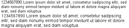
At twelve pixels, Helvetica suffers from jolting kerning, and its bubbly letterform is both inefficient and more taxing on the eye.
At twelve pixels, arial can say more in less space without cramping, and its even spacing and less vigorous letterform makes it more readable.
It is true that at many sizes, arial has less character than helvetica, but in a medium with 72 pixels-per-inch as opposed to several thousand, this utilitarianism deserves kudos rather than disparagement. Which is why, on the web, I believe that Helvetica works best as a display face. Only at the larger sizes do Helvetica’s nuances add character rather than detract from readability, though it still suffers from the occasional odd kern.
HELVETICA’S own 48 pixels.
ARIAL’s own 48 pixels.
This brings up another point I’ve been wanting to make for some time. We are not limited to a handful of typefaces on the web. The letterform varies so much between the different sizes that I’d go as far as to say they belong to different font families.
For example, At 12 pixels, Verdana is a wide face, apertures gaping and unadorned.
At 21 pixels, Verdana is truly a foxy face, especially in lighter shades. Its apertures pinch to become slightly pearshaped.
Take Georgia at 12 pixels, a narrow, rectangular form.
At 13 pixels, Georgia starts to exhibit some glimmers of an entirely new character, gently rounding.
By 24 pixels, the letterform narrows slightly and the stroke modulates as it begins to more closely approximate a print face.
Another aspect of type that changes at different sizes on the web is its aliasing, and it is important to look out for the threshold between aliased and anti-aliased type. On Internet Explorer 5+ for the Mac, this defaults between 13 and 14 pixels.
 Perfectly readable at 13 pixels (though small for some’s taste) the anti-aliasing at 14 pixels introduces gradiation before the stroke is thick enough to handle it gracefully. By 15 pixels Arial is doing better, and by 16 has recovered completely. These thresholds occur in every typeface, and are important considerations we haven't dealt with in print.
So, next time you feel like bemoaning the lack of choice, take some time to get close to the varied set of faces we actually do have.
Perfectly readable at 13 pixels (though small for some’s taste) the anti-aliasing at 14 pixels introduces gradiation before the stroke is thick enough to handle it gracefully. By 15 pixels Arial is doing better, and by 16 has recovered completely. These thresholds occur in every typeface, and are important considerations we haven't dealt with in print.
So, next time you feel like bemoaning the lack of choice, take some time to get close to the varied set of faces we actually do have.