 Suddenly, the simplistic ‘serif or not’ deliniations we use to categorize type seem inadequate. Simply commenting on whether a letterform has feet or not prevents us from looking at the characteristics that truly define how that letterform strikes us on a page. And as Bringhurt’s book analyzes the letterform for it’s use as type, not decoration, an analysis that takes into account it’s overall appearance as black- and white-space on a page seems in order.
So I started looking at type from another simplistic perspective, but one simplified along the lines of impact rather than adornment.
Suddenly, the simplistic ‘serif or not’ deliniations we use to categorize type seem inadequate. Simply commenting on whether a letterform has feet or not prevents us from looking at the characteristics that truly define how that letterform strikes us on a page. And as Bringhurt’s book analyzes the letterform for it’s use as type, not decoration, an analysis that takes into account it’s overall appearance as black- and white-space on a page seems in order.
So I started looking at type from another simplistic perspective, but one simplified along the lines of impact rather than adornment.
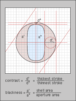 Here we are looking at type along the lines of its contrast (the ratio of its thickest stroke to its thinnest) and blackness (the ratio of its outer shell to the hole in the middle).
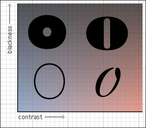 At the left we have the letterforms with low-contrast, even strokes; to the right we have letterforms with high contrast, varying stoke width. From bottom to top the blackness increases.
For demonstration purposes I have only used four extreme samples, but we can plot any typeface on these axes.
At the left we have the letterforms with low-contrast, even strokes; to the right we have letterforms with high contrast, varying stoke width. From bottom to top the blackness increases.
For demonstration purposes I have only used four extreme samples, but we can plot any typeface on these axes.
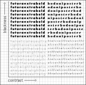 When we are choosing a typeface for large reams of readable text, we tend to go for medium contrast, low–mid-blackness serifs; for digital media a light, low contrast sans-serif is generally preferable. For display purposes, the serif is selected for its acquired historical symbolism, and the contrast and blackness for the sort of impact we need.
. . . . . . . .
Bringhurst goes into a detailed breakdown of the historical classes of type (scribal, baroque, romantic, geometric, etc.), and how the cultural and physical attributes of these letters can help us choose appropriate typefaces.
For instance, both Bodoni and Futura are strongly geometric letter-forms, and this explains why the pairing of these two type-faces is so sucessful.
. . . . . . . .
Here are some of the simple rules Bringhurst introduces, which I have distilled into thumbnail diagrams. Once you’ve read the accompanying text, hopefully these little icons will make sense, and then merely looking over the icons would refresh you about the various nitty-picky rules below.
When we are choosing a typeface for large reams of readable text, we tend to go for medium contrast, low–mid-blackness serifs; for digital media a light, low contrast sans-serif is generally preferable. For display purposes, the serif is selected for its acquired historical symbolism, and the contrast and blackness for the sort of impact we need.
. . . . . . . .
Bringhurst goes into a detailed breakdown of the historical classes of type (scribal, baroque, romantic, geometric, etc.), and how the cultural and physical attributes of these letters can help us choose appropriate typefaces.
For instance, both Bodoni and Futura are strongly geometric letter-forms, and this explains why the pairing of these two type-faces is so sucessful.
. . . . . . . .
Here are some of the simple rules Bringhurst introduces, which I have distilled into thumbnail diagrams. Once you’ve read the accompanying text, hopefully these little icons will make sense, and then merely looking over the icons would refresh you about the various nitty-picky rules below.
‘The principles of typography as I understand them are not a set of dead conventions but the tribal customs of the magic forest.… Originality is everywhere, but much originality is blocked if the way back to earlier discoveries is cut or overgrown.’
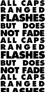
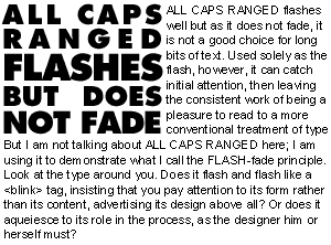
 The FLASH fade principle:
 ‘…typography must often draw attention to itself before it will be read. Yet in order to be read, it must relinquish the attention it has drawn.’
 However:
 Justifying
You may justify wide columns, but leave multiple narrow columns ragged, both horizontally and vertically, or at the very least vertically ragged. And don’t ever hyphenate ragged columns.
Justifying
You may justify wide columns, but leave multiple narrow columns ragged, both horizontally and vertically, or at the very least vertically ragged. And don’t ever hyphenate ragged columns. Paragraph breaks
For long runs of text, use indents for new paragraphs. On shorter bits of text a simple line of whitespace will do nicely.
Paragraph breaks
For long runs of text, use indents for new paragraphs. On shorter bits of text a simple line of whitespace will do nicely.  Centering blockquotes
If you choose to center a left-aligned chunk of text (e.g. a blockquote), center it by its longest line of text.
Centering blockquotes
If you choose to center a left-aligned chunk of text (e.g. a blockquote), center it by its longest line of text. Widows and orphans
Basic terminology check: A widow is a line of text separated from its paragraph. An orphan is a word on its own
Widows and orphans
Basic terminology check: A widow is a line of text separated from its paragraph. An orphan is a word on its own
line. The Golden section
The Golden Section is a mathematical ratio used through history, in nature, and in the Fibinacci sequence that is widely considered the root of many beautiful forms. It is approximately 1.6218, or 5:8.
The pattern of shapes used most often to display this ratio is a series of spiraling rectangles, each with sides of the ratio 1:1.62. The short side of each subsequently larger rectangle is the same length as the long side of the small rectangle, and it’s long side is 1.62 times it’s short side.
Setting the scale of type-size based on the golden section gives us a beautiful ratio as well:
5pt
8pt
13pt
21pt
34pt
45pt
The Golden section
The Golden Section is a mathematical ratio used through history, in nature, and in the Fibinacci sequence that is widely considered the root of many beautiful forms. It is approximately 1.6218, or 5:8.
The pattern of shapes used most often to display this ratio is a series of spiraling rectangles, each with sides of the ratio 1:1.62. The short side of each subsequently larger rectangle is the same length as the long side of the small rectangle, and it’s long side is 1.62 times it’s short side.
Setting the scale of type-size based on the golden section gives us a beautiful ratio as well:
5pt
8pt
13pt
21pt
34pt
45pt
 Multi-column scrolls
This isn’t anything Bringhurst said, but reading about the first typefaces made me realize that if a scroll in the old days were multi-column, why it just had to be a horizontal scroll.
I’ve always thought of scrolls as vertical, which would work fine for a single column of text. But if they ever used multi columns, a vertical scroll would necessitate that they divide the chunks of text into blocks like pages to break up the scroll. The eye would have to read a pre-sized page chunk, then leap back to the left-most column as we unrolled more of the scroll.
Much more work than fixing the height of each column and simply unrolling the scroll sideways as we read along.
Multi-column scrolls
This isn’t anything Bringhurst said, but reading about the first typefaces made me realize that if a scroll in the old days were multi-column, why it just had to be a horizontal scroll.
I’ve always thought of scrolls as vertical, which would work fine for a single column of text. But if they ever used multi columns, a vertical scroll would necessitate that they divide the chunks of text into blocks like pages to break up the scroll. The eye would have to read a pre-sized page chunk, then leap back to the left-most column as we unrolled more of the scroll.
Much more work than fixing the height of each column and simply unrolling the scroll sideways as we read along. Web scrolls
This means that once we have a useful way to make multi column layouts on the web, the now-maligned horizontal scroll will actually be better suited for web text.
Otherwise, how would the computer know where to cut off the columns? If they were cut off at the height of the page, we would have no choice but to scroll horizontally.
Web scrolls
This means that once we have a useful way to make multi column layouts on the web, the now-maligned horizontal scroll will actually be better suited for web text.
Otherwise, how would the computer know where to cut off the columns? If they were cut off at the height of the page, we would have no choice but to scroll horizontally.