")


¶ I have discovered that Fiji’s profusion of old more than makes up for its lack of new. Limit your view of Fiji to the periodicals and you could be in The Royal Tenenbaums. Familiar yet foreign, this is stuff I might have glanced over my father’s shoulder at. Musty magazines with the blocky serif typographics I was taught in school but never actually used. And filled with the opinions learned in school but no longer expressed.
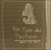
¶ I first opened LES ILES DE PACIFIQUE at a housewarming party in Suva, Fiji. The title page alone ensured that I would no longer be social that evening. It was gorgeous. Frameable. And while my idea of the 80’s is pastel izod with starched collars and converse all star, the 1980’s Pacific described in this book no longer existed, and was described in a tone no longer tolerated: e.g. ‘Missionaries terrorised by countless taboos.’
¶ I’ve learned alot about the role of trends in design from these old books and magazines. Whatever the trend, it is readily identifiable whenever you look. Strange to see everyone using fat serifs stacked like logs when no-one does nowadays (at least until 1980’s reinvention are once again trendy). And it seems designers have been more concerned with how type looks than how it reads for quite some time.
¶ The foxiest pages in this book are the most rote: the index, the photo credits. These are stark geometric arrangements of unforgiving sans that would make a wonderful Mondrian, but are perhaps less appropriate for conveying much information. I was confused by this at first — why would the dullest pages make the most striking layouts? — but once I realized the text consisted of unrelenting columns of three I saw that those few atypical pages must have been a great relief from the overbearing grid that terrorizes most of the book, much as the sauvages had once terrorized the missionaries with their own rigid customs. Was she commenting on the irony of the text?
¶ Which brings us back to when in Rome… and in turn to Goujou, and to the mystery of the font that looks so much like Aksidenz but is decidedly not. A leaner, suppler Aksidenze, more in touch with his feminine side. Perhaps Aksidenze's french cousin. And finally to that place we must always go: the table of contents. Usually the tamago zushi 1 of any typographic achievement, this one is what Kurtz must have been moaning about. I can only think that Goujou has paid for every wieght of the title page font as well as of Futura, et mon dieu she was going to use them all, even if they all ended up on the T.O.C. Perhaps they freelanced it to the designer of the original komlas.2
¶ So these are the mysteries I ask you to help me uncover: mise en page Nicole Goujou Imprimerie GEA (Milan) ISBN 2-03-513-182-0 Daniel Moreau Editor This is a review of sorts, and it needs you to complete it. Please send your findings to chris@designhistoryinabox.net.
++++++++++++
1 Tamago zushi means egg sushi, and someone once told me we should judge a sushi chef by this piece.
2 On my way to the interior of Viti Levu, Fiji, we dined at a Vegetarian Fast Food Restaurant called Komlas, whose menu was so incredibly ugly I was awestruck, and have been whittling at a derivative website ever since.